Crafting Christmas: Blending Bespoke Design with Digital Innovation in Reading
As a creative agency based in Reading, we are proud of our ongoing relationship with REDA and our collaboration on numerous Christmas campaigns over the years. These campaigns have become a highlight of our year, showcasing innovative creative approaches and the distinctive thinking that defines our agency.
The campaigns spotlight Reading’s many attractions, including its extensive shopping options, diverse dining experiences, and a variety of festive events in and around the town centre, making it a prime destination for individuals and families during the Christmas season.
Celebrating Reading’s multicultural significance and the diversity of its communities is a central focus. This vibrant culture forms the backbone of our campaigns, ensuring our messaging and artwork connect with audiences of all ages and backgrounds.
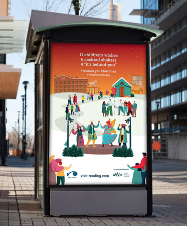
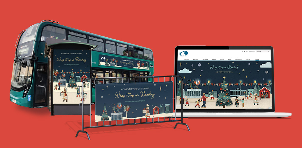
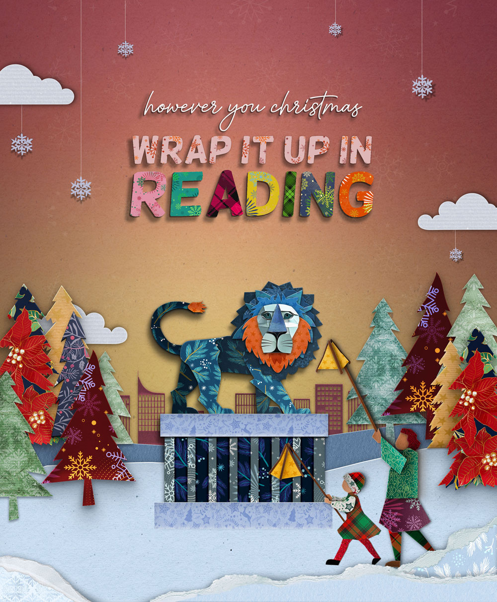
Over the past two campaigns, we worked within a brand framework and illustration style that embodied the spirit of Christmas in Reading. This year, we took a fresh approach with a new creative look to support the theme: ‘Wrap it up in Reading.’ The concept highlights Reading as the ultimate one-stop destination for all festive needs.
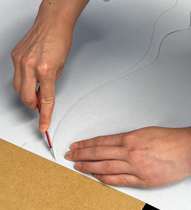
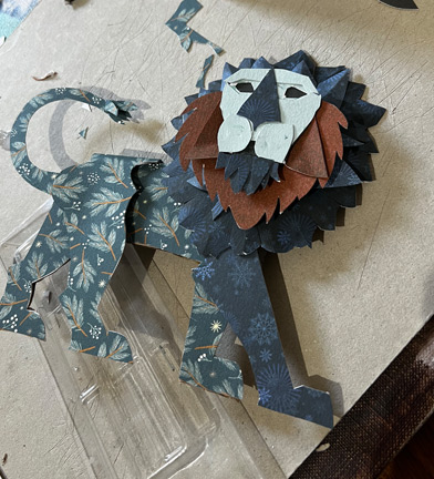
Our creative journey started with the iconic Maiwand Lion, reimagined as a paper model made from wrapping paper and inspired by Victorian paper theatres. The lion was printed, assembled, and placed within a diorama of Forbury Gardens, featuring festively wrapped lantern bearers from the Reading lantern parade. This diorama became the centerpiece of the campaign, shaping its direction.
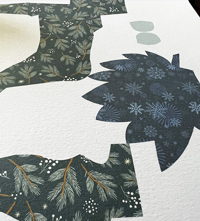
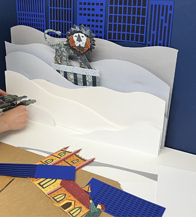
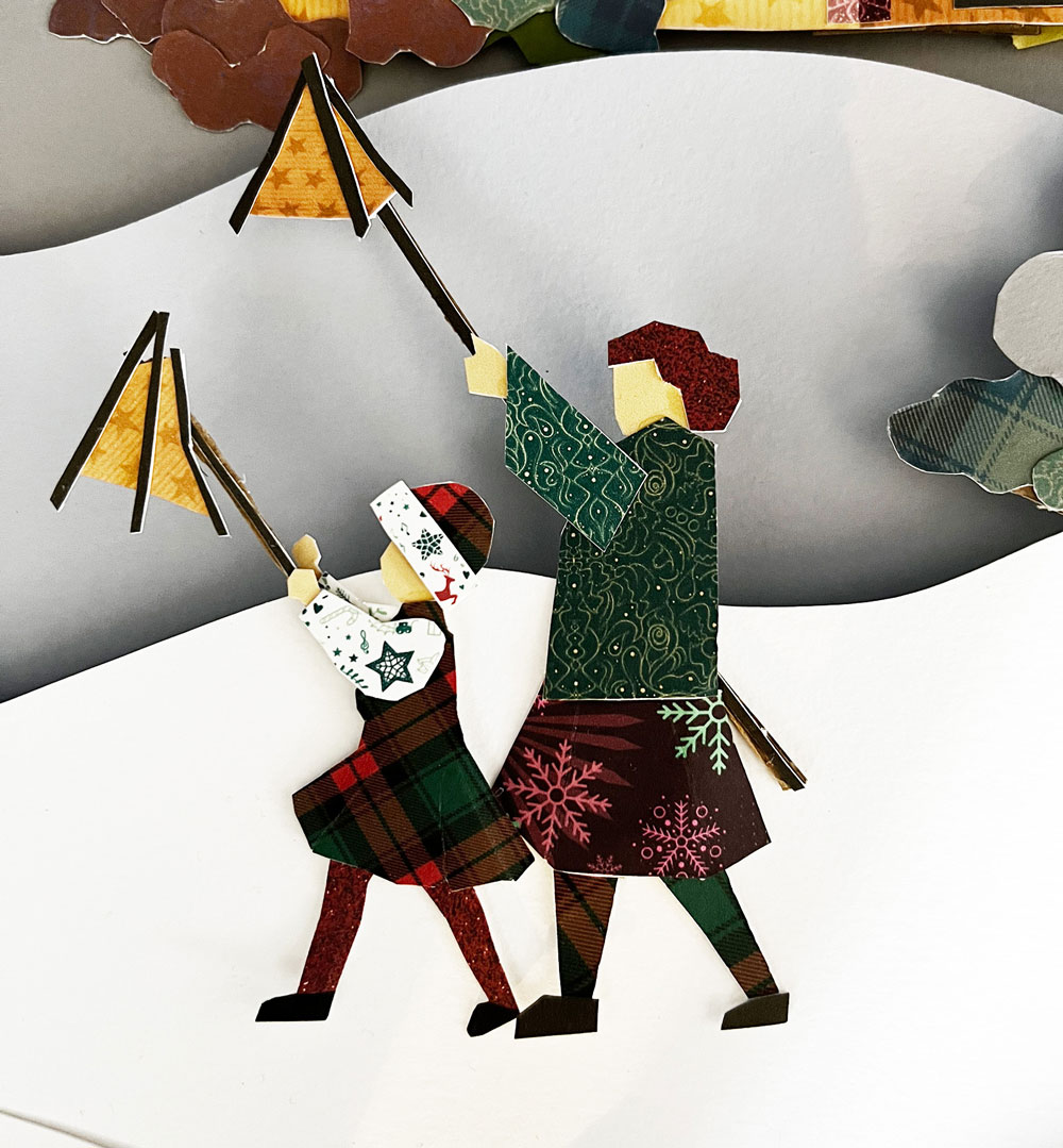
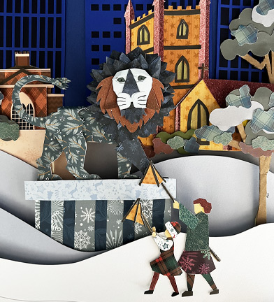
We needed a set of versatile assets that could work seamlessly across various platforms, including video. This requirement posed significant challenges for us.
We faced many issues with physically cutting and assembling components. The small models looked great, but didn’t work well when scaled up and layered. When photographed, the quality didn’t meet our standards. Creating new pieces or making last-minute changes was also time-consuming, which is a problem for big campaigns, especially when new assets are needed for last-minute ad opportunities. Animating the physical models added even more challenges, so we decided to switch to fully digital illustrations.
We worked to emulate the appearance of paper models using Photoshop. This involved creating custom layer styles to mimic the shadows and bevels of freshly cut paper, adding wrapping paper patterns and textures on top. The process, though highly intricate, resulted in vibrant, colourful assets that could be quickly adapted and replicated for use across various platforms, including digital GIFs and animated videos.
The aesthetic appeal of the campaign inspired us to develop a custom wrapping-paper-themed font to complement the artwork. but we soon realised that this made the design overly busy. Combined with our initial colour palette, the campaign began to resemble a children’s book illustration. So we introduced a more sophisticated font pairing and refined the colour palette to a harmonious selection of blues, whites, and reds.
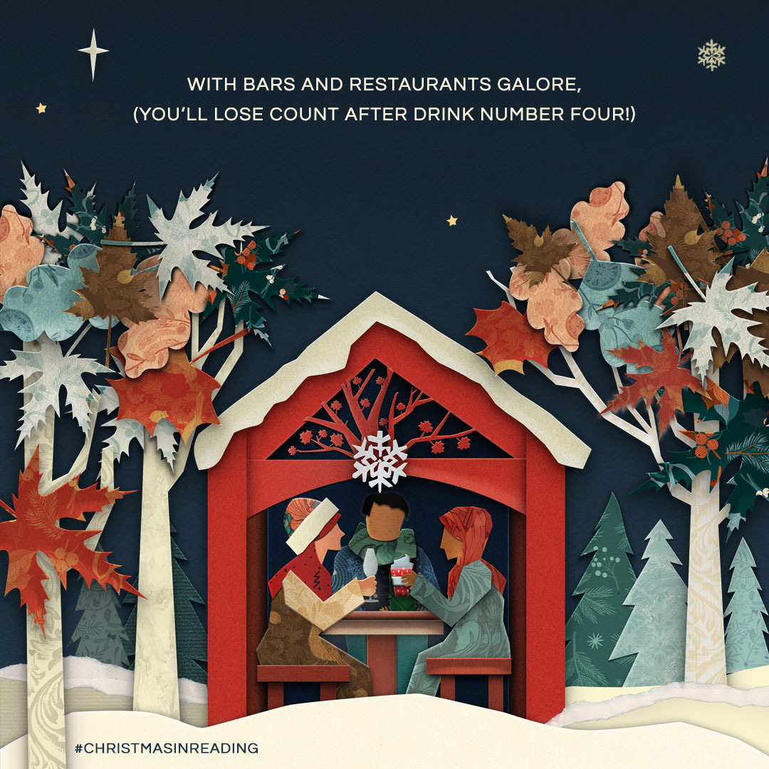
To retain the playful nature at the heart of the campaign, we incorporated short, two-line rhymes highlighting Reading as a place to shop, celebrate, and be entertained.
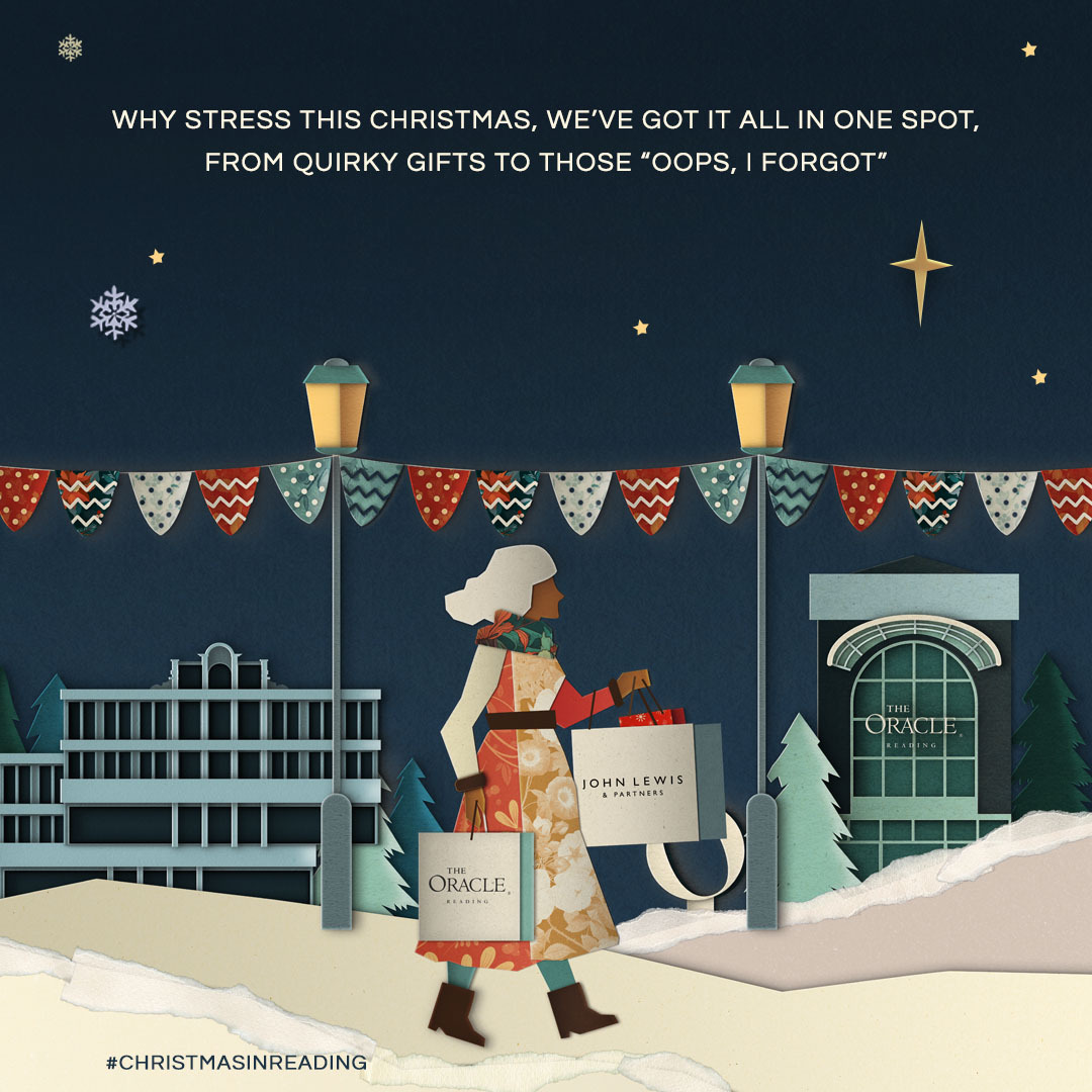
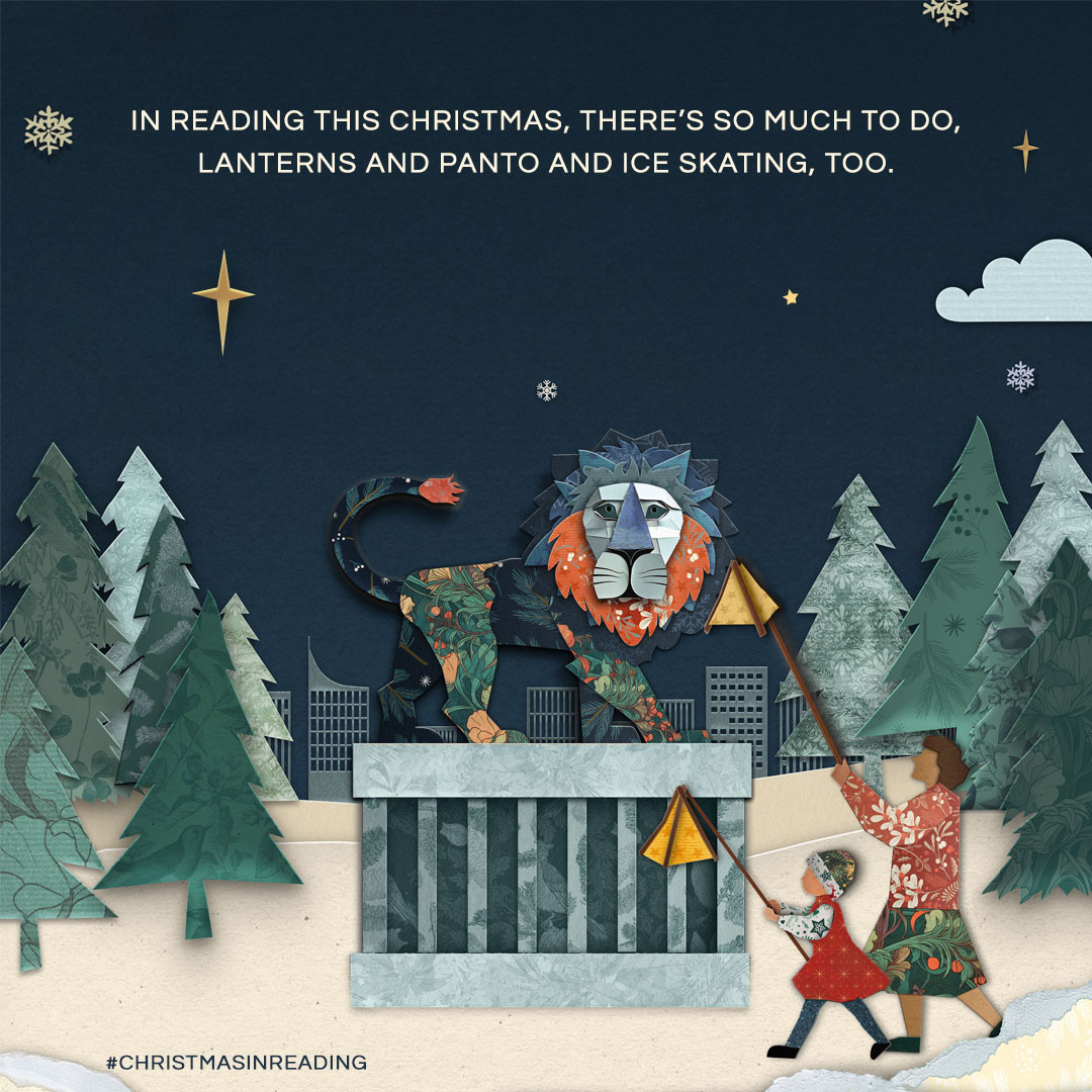
The campaign has undergone several iterations throughout its journey, but ultimately was delivered by keeping in sight the requirements of the campaign. There is undeniable appeal in crafting bespoke artwork in an increasingly digital world, and it is certainly an approach we are keen to explore further. But, with the insights gained from this venture into handcrafted design, we plan to approach similar projects in a more refined manner—hopefully with far fewer papercuts.